-
Context
Dy’on were seeking a digital agency capable of aligning their communications with their high-end expertise.
-
Solution
In-depth strategic thinking made it possible to establish a clear brand territory aligned with their DNA, as well as a complete redesign of the website.
-
Results
A brand strategy and a website that will help Dy’on to establish their place as a leader in innovation, aesthetics and manufacturing quality in the equine world.
Strategy
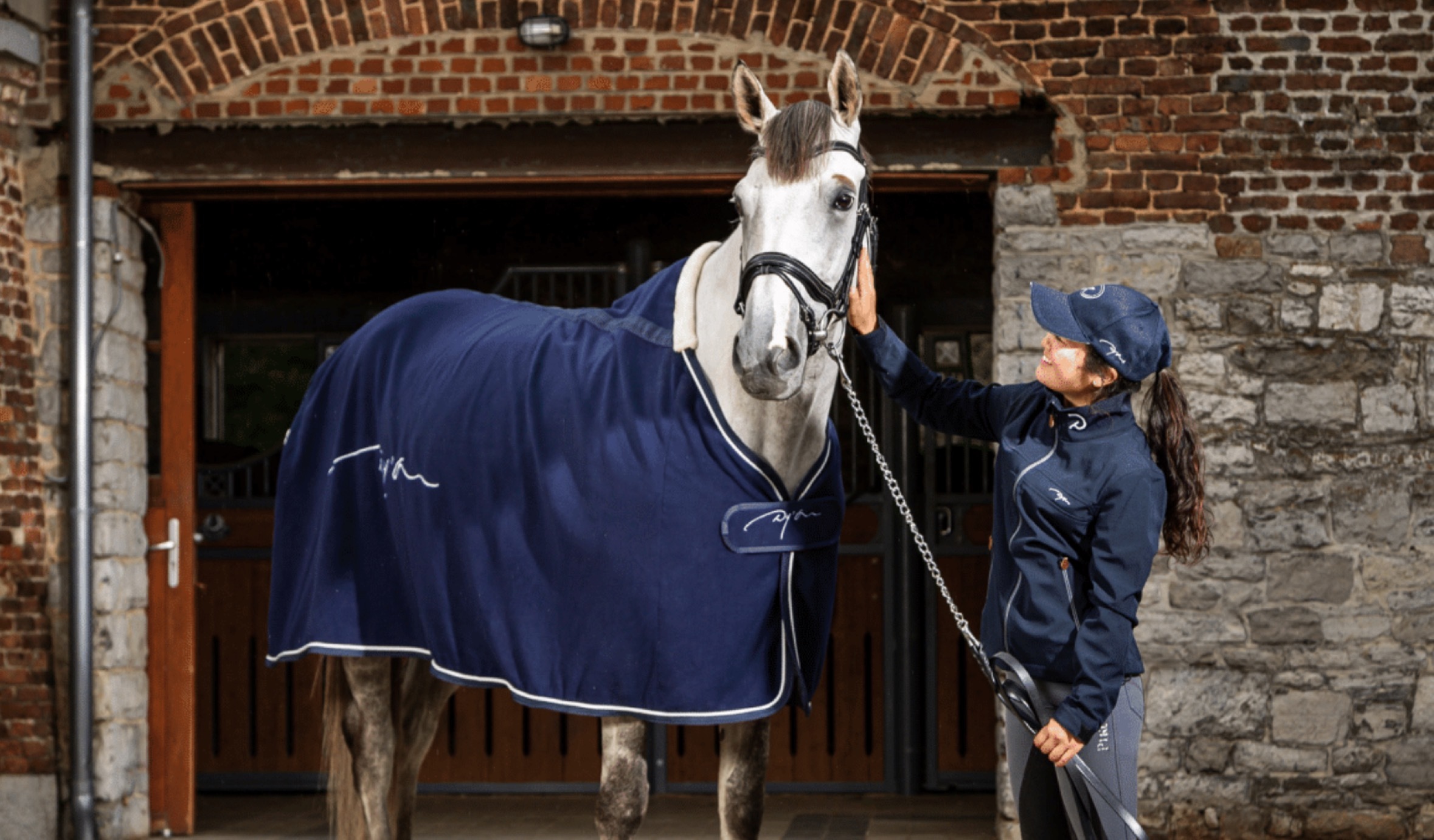
During the immersion phase, we rapidly came to understand that Dy’on were considered a reference brand in equestrianism. The innovation, quality and durability of their products are attributable to their comprehensive understanding of the varied relationships between human and horse, and their exacting standards.
However, their communications tools were not aligned with this expertise. This is why Dy’on’s team were looking for an agency capable of understanding and translating their DNA through their communications and website.
We needed to demonstrate the symbiosis that bonds a person with their horse, and Dy’on’s ever greater quest for personalisation.
Our strategy makes it possible to highlight this pursuit for the wellbeing of the horse, and that of the humans that ride them.
Enjoy Every Ride, because every relationship and every horse is different.
Whether you are a professional eventer, or enjoy the occasional hack, it is essential to have the right equipment if you want to make the most of your ride.
User experience
The central element of the website is of course their catalogue, but it has to be more than simply functional.
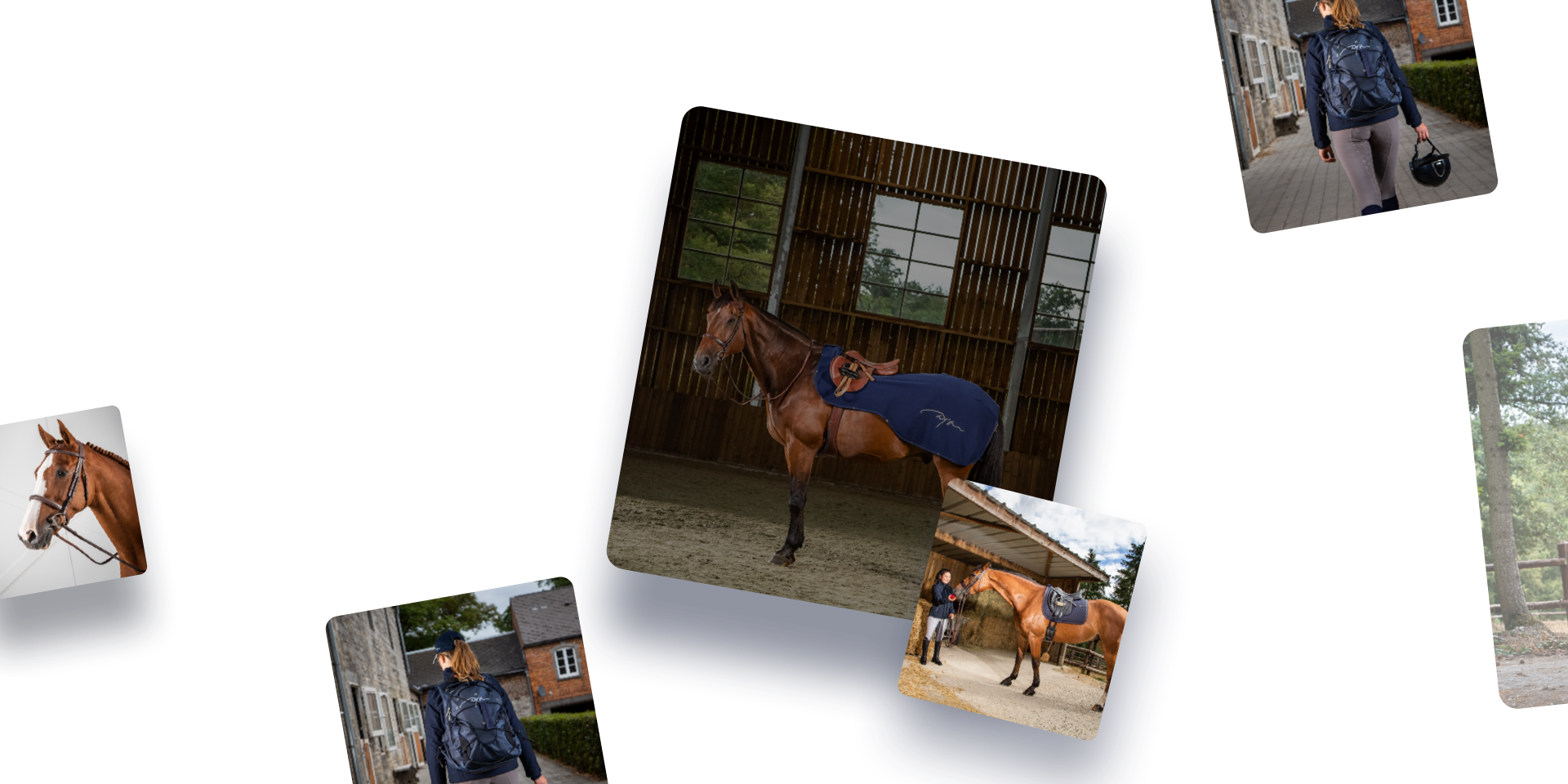
Dy’on positions itself at the high end of the market, and the details are important. They represent the brand’s excellence, durability, and innovation. The photos convey that the products are refined, and are designed and manufactured with meticulous attention to detail. This is not our first catalogue. Similarly to our projects for Le Lombard and CM-tourisme, the product visuals must take centre place on the site and the quality of the interface must make it possible to capture every detail.
Strengthening the relationship between Dy’on and their distributors
Dy’on maintains a close relationship with its global distributors. Hence an additional aim for the site to maximise their visibility. As such, significant work was put into locating the closest Dy’on distributor.
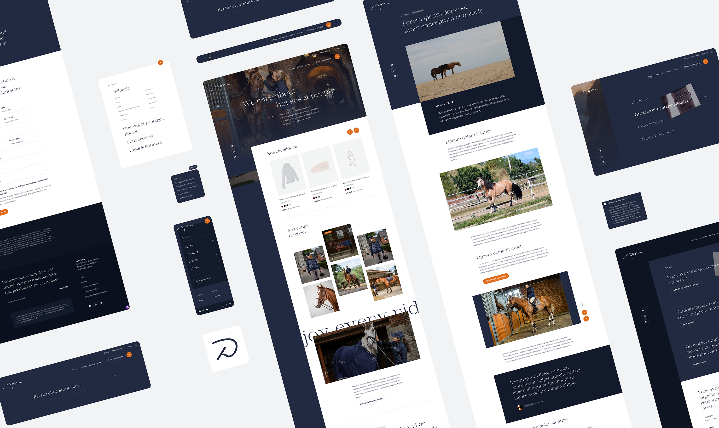
An effective and user friendly tool for our customers thanks to CraftCMS
The user experience is also designed for our customers. We are seeking a collaboration, and with that in mind we promote customer autonomy. This requires a user-friendly website. For Dy’on, we use Craft CMS, an open-source, flexible framework which facilitates ease of use.
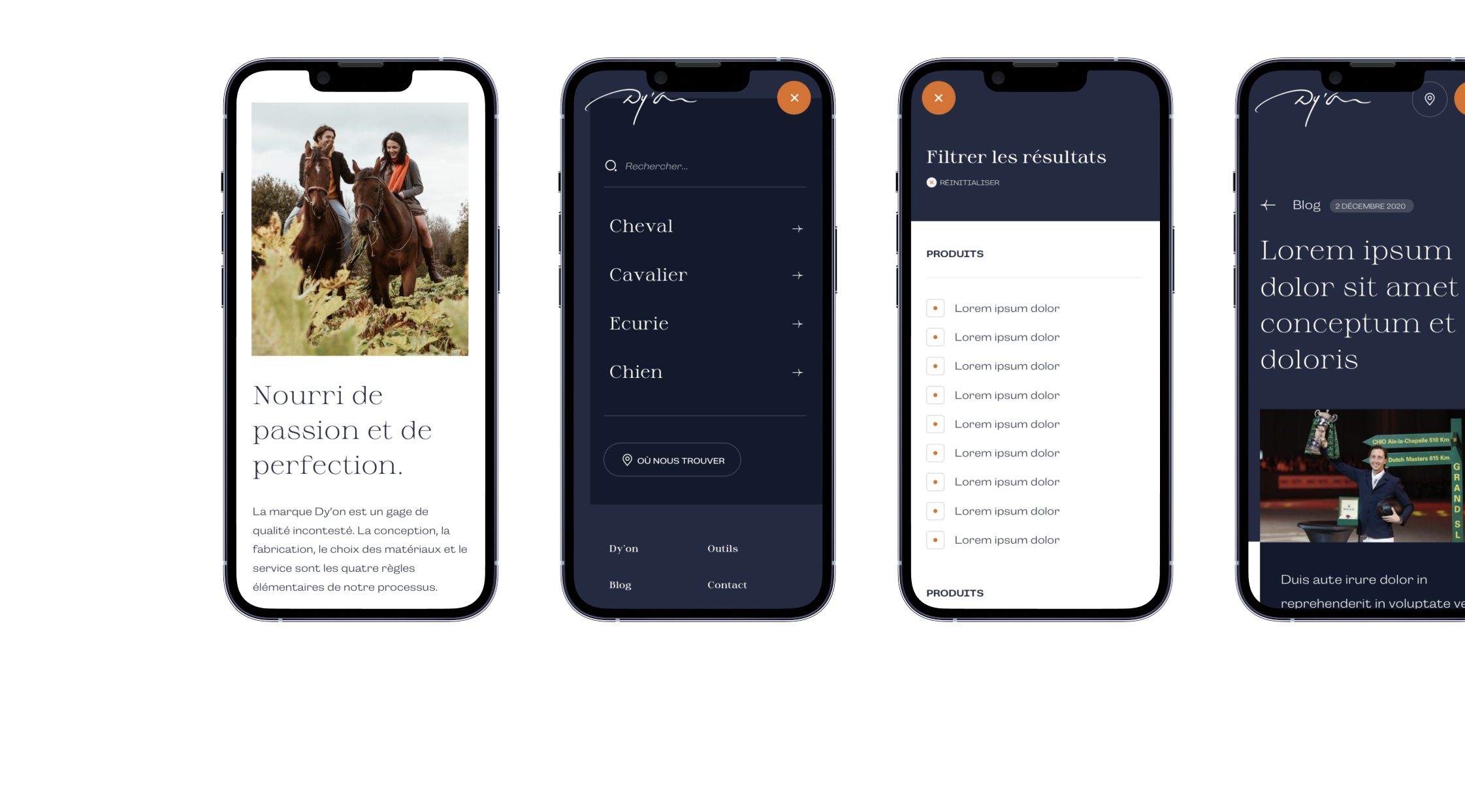
Development & website
One of the project’s challenges was to make Dy’on’s 2,500 catalogue items accessible on the website. To achieve this, we developed a bridge between Mercator - the ERP used by the customer - and Craft CMS. This way, the product entries are automatically synchronised on a daily basis. During the import, the product categories are also restructured in order to optimise site navigation for the users.
We also created a map to help consumers to locate their closest distributor. Dy’on can easily add a new distributor to the 350 already listed, using the CMS.
Website link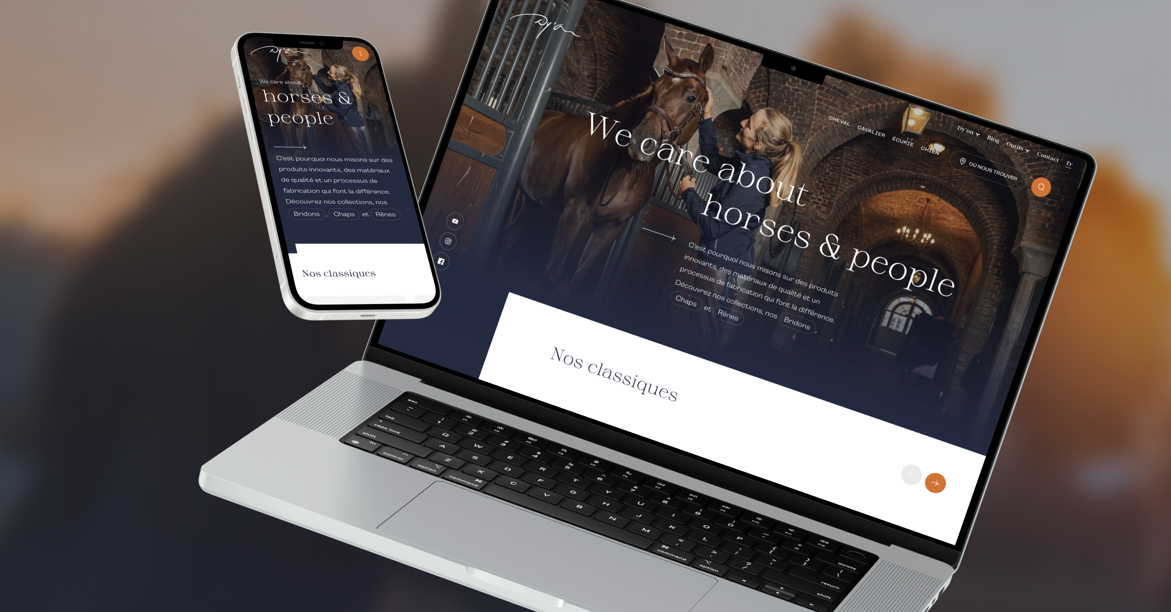
More to come soon!
There are already new projects in the pipeline to boost Dy’on’s visibility. Follow us on Facebook, LinkedIn or Instagram to find out more as soon as the new projects are released!
